By Lisa Reis
P2 Realty Inc., Brokerage
It goes without saying that real estate agents see a lot of home interiors, likely more than interior designers themselves. Designers are only called in when someone knows they need a renovation refresh. Real estate agents, see homes all day, every day, resale and new.
There are homeowners that decorate (and I’m applying that term loosely) and would never hire someone to provide direction or counsel them on choosing the home’s colour selections… thinking they’ll just do what they like. Therein lies the problem when that homeowner looks to sell the home in the future. It becomes the agent’s challenge because we have to sometimes uncomfortably communicate points to help make the home sellable – paint it, fix things, renovate, furnish and stage.
As a certified interior decorator, home stager and co-author of an Amazon best-seller “Home Staging Secrets,” having a keen sense of design is almost like being a hairdresser who looks at someone and knows right away that their hair colour or hair style is off… they just see it, they get it and know how to fix it. It can be an occupational hazard to see some almost-there homes; but then the design features and finishes have gone sideways, it makes these homes difficult to sell for top dollar. That’s commonplace for resale where homes are older and need updating.
However, there’s a trend I’m seeing a lot lately, while showing new home inventory (or assignment homes)… where the prospective homebuyers don’t like what they see.
And it’s a brand new, move-in ready home.
Design is so simple, that’s why it’s so complicated.
Some homebuyers can’t get past the visual first impression, objecting to things like multiple-coloured woods throughout the home, plain, natural honed, oak staircases, merging with beach greige LVP flooring and then faced with the eye-sore, of rustic-looking, cherry-finished, country kitchen cabinets.
(Original photo not shown to protect the seller).
I observe the potential homebuyer’s face and notice their eyebrows arched; nose wrinkled as they say “what builder picked these finishes”? In their eyes, the way the home looks ends up reflecting on the builder – not the purchaser who picked this hot mess combo-of-finishes. Homebuyers literally say things like “How could the builder let someone pick this mismatched mess? Who would live in this?” We hear things like: “The first thing I would do if I had to buy this place is:”
Rip out the (brand new) kitchen cabinets,
Rip out the carpet
Change the wood or LVP flooring
Change the shower tile
etc.
…THIS… in a brand new, never lived in home!
And just like that, we’re exiting the house, we don’t even make it to the second floor. The size and floorplan may be perfect, but we move on because the home’s finishes are just not attractive and would require an extensive reno to appeal to the homebuyer… when it should be move-in ready.
Here’s where my public service announcement comes in.
Not only is unattractive design bad for the environment by unnecessarily adding to the landfills, but it hurts the builder’s reputation too.
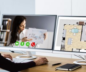
These scenarios could easily be avoided if builders would provide their professionally chosen standards as “complete” packages, complete with 3D visualizers that demonstrate how the finished home will look, complete with a walk-through tour.
Design needs cohesiveness, not compromise.
I’ve been at many design consultations… where there are undecided homebuyers who spend upwards of a half-day picking out selections “playing interior decorator” and they are making bad choices. Materials strewn all over the floors, being chosen by couples who have opposite tastes and they end up compromising.
Friends don’t let friends drive the design.
Sometimes, purchasers to the design centre even take the “can I call a friend” approach, where they FaceTime a friend to get a final opinion on their selection choices. This can only go downhill, it’s surely a slippery slope.
They’ll pick an 1980s (rounded) looking natural finish handrail with rounded wood pickets, which can be seen from the open concept main floor, which includes a modern, linear, glossy kitchen cabinet profile. Talk about a design contrasting eye sore.
This doesn’t need to happen. Builders have beautiful model homes. We know they have interior design teams. Maybe they should put more of the “design” back into the design centre process.
The majority of homebuyers may not be skilled at conceptualizing the design concept at large, but they are comfortable with visualizing rooms in 3D, similar to how they view the “after” inspo on HGTV reno shows.
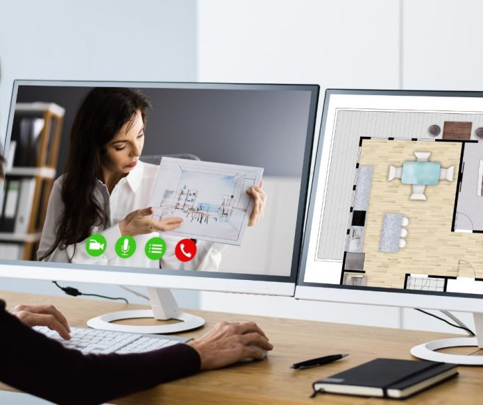
If I had one wish or piece of advice, it would be that builders abandon the concept of a sprawling design centre, take that valuable real estate space, and invest in digitizing the whole design and colour selection process, all via 3D visualizers. It can still be presented in person in a more scaled down, minimalist design centre and of course it can be presented virtually at the convenience of the buyer’s schedule.
Every single step, from picking the knobs, cabinetry, baseboard profiles, pickets to pocket doors, it can all be done digitally with photo-realistic renderings and digital walk throughs. The technology exists. I’m happy to introduce you to a number of suppliers if you wish.
If you think good design is expensive, you should look at the cost of bad design.
Things to consider:
- Saving a half a day, times 100s of home selections per homebuyer/investor. Let’s do the math. Imagine you have a subdivision of 500 homes. Two design consults a day times five days equals 10 design selections a week divided by 500 homes equals 50 weeks of performing half-day selections. Practically a full year.
- Done digitally, it can all be accomplished in 60 to 90 minutes.
- We need homes built faster and more efficiently, it’s clear that the design selections are contributing to the bogging down of efficient closings (along with municipal approvals and material shortages – but that’s a topic for another day).
- Working with a digital design centre, will prevent costly renos ending up in the landfills.
- If done digitally with 3D visualizers of professionally, pre-selected options, homebuyers would see the finished results immediately versus samples strewn across a table or floor, causing mass confusion and homes that are not professionally designed… and hoping it will work out.
- Homebuyers can prevent costly design faux pas (with what is likely the most expensive investment of their lives).
- It will make builder’s inventory homes a breeze to sell and for top dollar.
- Assignments will also sell faster and for top dollar, making your investors happy.
- Homebuyers can still enjoy picking and choosing features/finishes… but they would be selecting from a designer’s curated collection – that’s sure to look great.
- Imagine, every feature and finish could immediately be recorded in a streamlined process – digitally, not in someone’s illegible handwriting, no more, “but I thought I was getting this, not that, I thought this was the finish.” Currently, at the end of the half day process, homebuyers walk away with a small deck of paper that equates to what they just selected, typically with no visual references. It’s just not a user-friendly experience.
- The design team then has to manual enter all the orders… which is on top of the half day the design team spent with the client, picking random selections.
- There can still be opportunities for upgrades, they would be added to the already professionally curated features and finishes.
Digital, 3D visualizers would greatly help automate the process. Ironically, developers have been applying some of these practises in highrise (for example, pre-selected, curated design packages)… it may be time to take a cue from the condo process when it comes to lowrise design selections.
Digital 3D visualizers, are also commonplace when buying a car. Today, you can tap and click your way through a computer screen, tablet or mobile device and in seconds, visualize your finished vehicle – inside and out – but the choices have been pre-selected by professionals – certain colours/fabrications can’t be selected if they don’t vibe with the car manufacturer’s vision.


The technology is here. Good design is good business.
Every great design tells a story. Make it part of your builder’s story.

Lisa Reis is the Director of Marketing and a Precon Sales Representative at P2 Realty Inc., Brokerage. Thoughts and opinions are strictly her own. p2realty.com, LisaR@P2Realty.com


